Ever wonder how to pull off a cohesive look in a room? Would you like to spruce up your space, but get stuck in the planning stages and don’t complete the project? Or do you buy house decor because it strikes your fancy in the store or online, but when you get it home it just doesn’t do what you’d hoped?
This blog post deals with color, one important element in putting together a room plan. In another post, we’ll explore other elements necessary for a lovely room plan.
 Color speaks persuasively. To dial in a look, consider the powerful voice of color. Color can whisper a calming lullaby or rev you up. It can impress with sophisticated flair or be homey and relaxing. Here is a short summary of the effects of color on our emotions. “Color can also affect emotional responses and create a mood. Greens tend to soothe, for instance, while yellows are uplifting and energetic. Bold reds are passionate and daring, but soft pink (a tint of red) is considered sweet and delicate. Blues are perceived as calming and quiet; oranges are warm and cozy; and purple, a truly complex color, can be seen as sexy or spiritual. Colors are considered warm or cool because of association. In our minds, we compare reds, oranges, and yellows with the warmth of the sun and fire. Blues, greens, and violets are cool because of their association with water, sky, and foliage.” http://www.bhg.com/decorating/color/basics/color-wheel-color-chart/#page=0
Wall Color- Neutral walls can be a blank canvas for other colors to play on. I like off-white because it is bright and airy, but not sterile. If you choose pure white, remember that it needs natural light. Dark rooms with artificial light make pure white look dingy. Many folks love neutral grays in a darker tone on walls because it’s soothing and cozy. Grays play well with many colors, especially lively ones like red. Neutral walls give us the latitude to play with accent colors and even change them out seasonally if they are mainly on interchangeable accessories like vases, pillows, throws, or art. If you have large rooms, you may want to try an accent wall in a complementary color to break up the expanse and create a focal point. Smaller rooms rarely benefit from a contrasting color accent wall because it breaks the flow as the eye travels around the room, making the room appear smaller.
Inspiration Color – usually you should choose the permanent items first, such as flooring, tile, cabinets, followed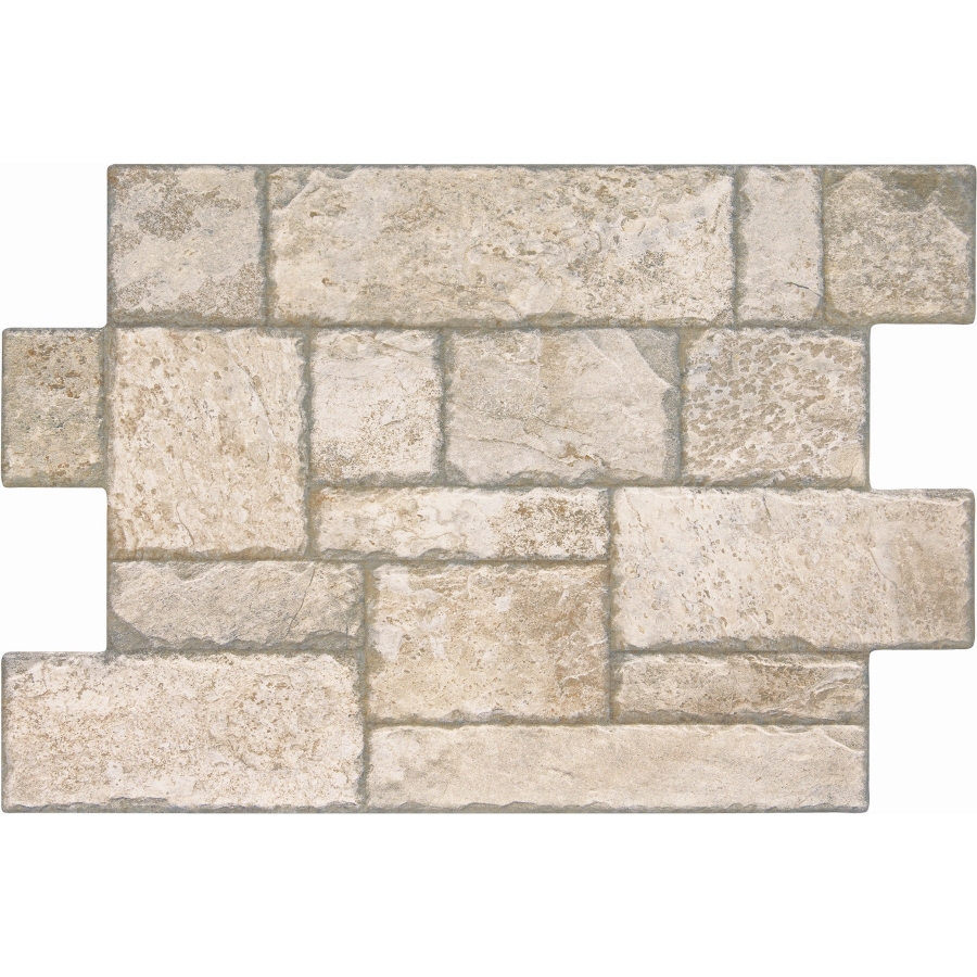 by choosing large furniture pieces. But surprisingly, it may be a small thing that is the key to a room. When I was planning the great room in our new house, my inspiration was a lamp shade. Sounds silly, huh? Early in our planning, I came across a silver mica lampshade that really resonated with me. The natural material was classic, yet unique. It’s pale, neutral color attracted me. It became my inspiration. It was the embodiment of what I wanted: light, neutral, natural, unique, unadorned. It guided me when I was in doubt about colors or materials. I knew I loved the look of the shade, so I compared other choices to the shade. It was my anchor. I chose a stone look backsplash because the natural material synced with the natural mica shade; rock to rock. The faux stone had light, neutral colors that were similar to the shade. The shade’s pale mottled glow inspired light, textured walls. The lampshade’s dark trim demanded bronze light fixtures. What could you find that would guide you? It should be something that you’re instantly drawn to. It could be something that isn’t even decor. Maybe a favorite dress, or a photograph, or even wrapping paper. Whatever is the embodiment of what you love.
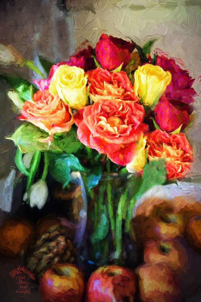 Accent Color – Small doses of color give life to a room even if you love neutral monochromatic color schemes like I do. During the cold, gray days of Fall and Winter, a kiss of color warms up a room. Choose a warm color like red, shades of orange, yellow, or yellow-green to bring cheer to dreary days. These warm colors could be introduced on a seasonal basis since we prefer cool colors during the hot months. Using accessories to carry color makes sense because they are less expensive and easier to store when not in use. For pops of color think throw pillow covers, blanket throws, real or artificial flowers, (I love potted flowers like poinsettias, amaryllis, and primroses for months of enjoyment.), pots and vases, throw rugs or area rugs, art, and books. For the hot months put away most of your accessories in order to get a clean, open look and use only cool accent colors like blues, blue-greens, or purples. Remember that texture affects the way we read color. Rough textures read color differently than smooth textures. In the cold months, we naturally gravitate toward soft, nubby fabrics such as bulky knits, furs, and velvet. These textures absorb light and make colors appear less intense, but touchable. In the hot months, we prefer smooth surfaces. We like cool cotton or linen next to us and smooth tile or bare wood floors under our feet. We like smooth, cool glass accessories or pottery. Smooth, hard surfaces reflect light and can intensify the color.
But you may love color in big doses instead of just on accessories! This is easier to pull off in larger spaces, but even a small room can handle one bold color. Usually, I recommend choosing large upholstered pieces like a sofa in a neutral color. But I have seen gorgeous rooms whose focal point was a bright, bold sofa. Just be sure you can live with that bold color for the life of the item. If you got a great deal on it, and you can afford to get rid of it in a few years, go for it! Bold walls used to be in favor, but you rarely see that trend now. But if you love bold, try it on one wall. Paint is a bargain for the impact it provides.
For Further Reading:
http://www.bhg.com/decorating/color/basics/color-wheel-color-chart/#page=0
https://www.diamondvogel.com/blog/what-your-front-door-color-says-about-you